Spiketrap’s Data Analytics Web Platform
UX/UI Design
From 2018 to 2022, I served as the UX/UI Design Director at Spiketrap, where I led the design initiatives during a period of significant growth. Starting with a core team of nine, I helped evolve the company into a robust organization that was eventually acquired by Reddit.

Spiketrap is a Data Analytics B2B Platform catering specifically to the entertainment industry.
Overview
Spiketrap is widely recognized as a pioneering company leveraging cutting-edge artificial intelligence technologies to meticulously collect and evaluate vast amounts of data regarding individuals' online sentiments and engagements pertaining to popular entertainment mediums such as video games and movies.
Their innovative approach enables in-depth insights into the constantly evolving landscape of online discourse, helping clients make informed decisions based on real-time feedback and trends.
Context
The stakeholders have determined that a complete redesign of the web platform is necessary at this stage of the company's journey. This decision aligns with the objective of addressing user requests and incorporating the new features that have been developed since the company's inception.
Role
Solo UX/UI Designer
Tools
Figma
Adobe Illustrator
Adobe Photoshop
Zeplin


Inspiration
//Inspiration
User Interviews
To tailor our redesign of Spiketrap’s platform to meet user needs effectively, I conducted interviews with clients from various roles within the entertainment industry. These discussions helped me understand their unique perspectives and identify the key pain points they experience while using the platform, ensuring our redesign addresses these challenges effectively.
“My task is creating detailed reports for products. Platform limits customization; need more flexible tool for better analysis”.
Data Analyst
“Our data quality is great, but platform navigation is complex. Advanced filters can speed up analysis for pivotal data narratives”.
Data Analyst
“Seeking an agile, data-rich dashboard for informed decision-making, offering a holistic at-a-glance view to steer strategies effectively”.
Manager
//Inspiration
User Personas


//Inspiration
User Journey and Flows
To design a user-friendly experience on Spiketrap’s platform, I utilized user journeys and flows to dissect and understand the typical paths taken by users. This analysis focused first on how users access the platform and locate a specific product called 'Monitor.' Following this, I explored the process users undertake to create custom reports.
By mapping out these processes separately, I pinpointed friction points and inefficiencies that users encountered along the way. My redesign efforts first ensured that logging in and navigating to 'Monitor' was seamless and intuitive. Subsequently, I focused on streamlining the steps to initiate and customize reports, making this task equally straightforward. The revised flows now guide users smoothly from one task to the next, significantly enhancing usability and reducing user effort.
Access the Platform
Custom Report Creation
Conceptualization
//Inspiration
Site Map
To gain a holistic understanding of Spiketrap’s platform and its structural hierarchy, I developed a comprehensive sitemap. This tool allowed me to visualize the entire layout of the platform, examining how various elements and pages interconnected. By analyzing the sitemap, I was able to identify key areas where the navigation could be optimized and where the user experience might be fragmented or overly complex. This bird’s-eye view was crucial for pinpointing redundancies and gaps in the platform’s architecture, enabling me to propose a more streamlined and logical structure that enhances user navigation and accessibility.
//Conceptualization
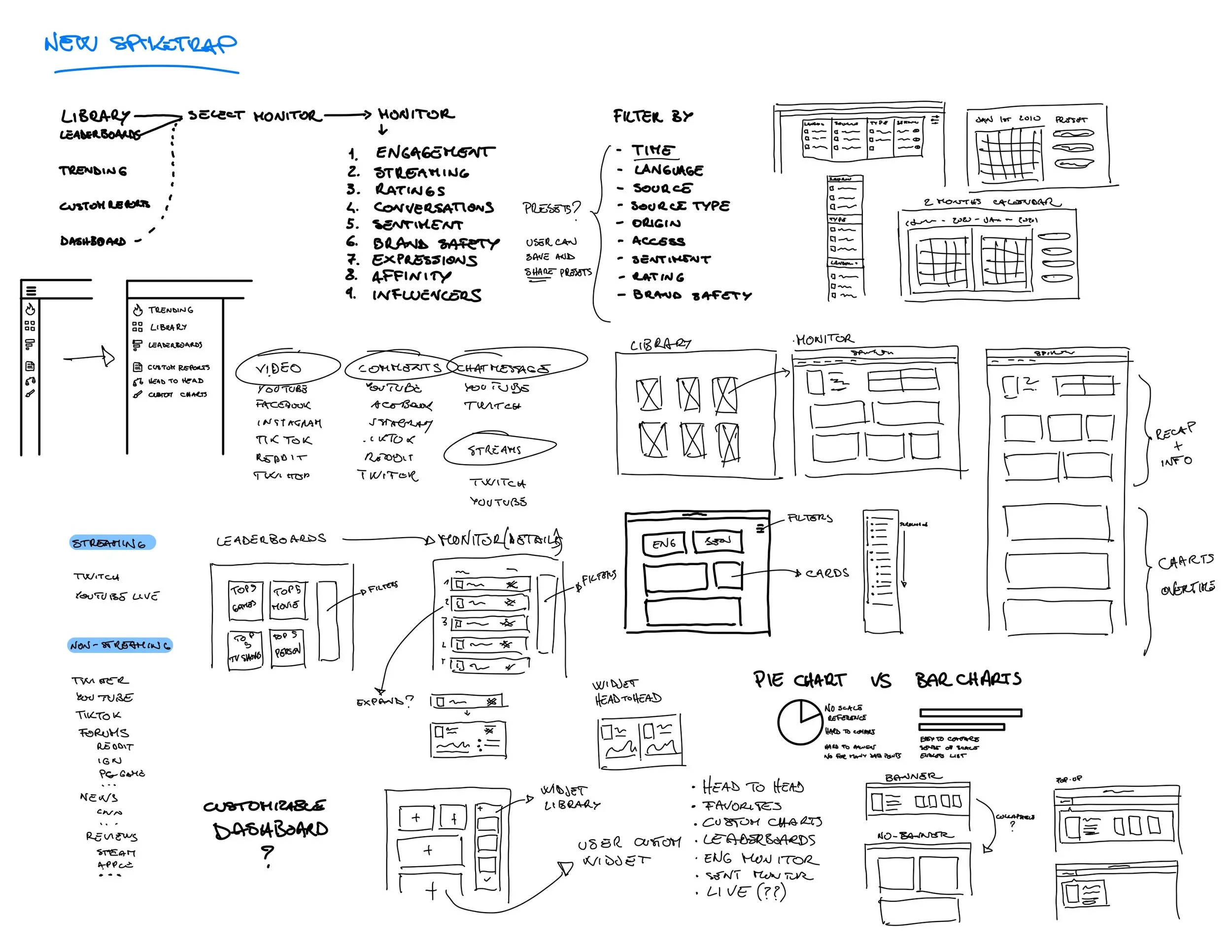
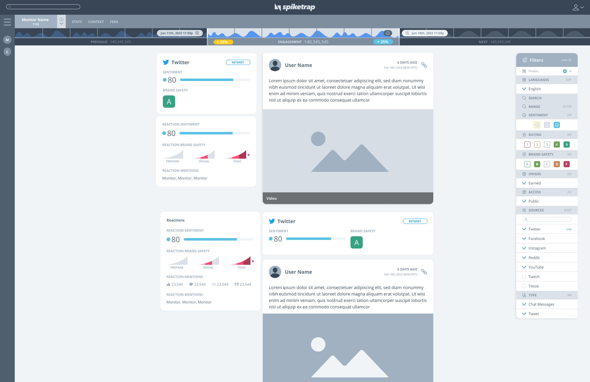
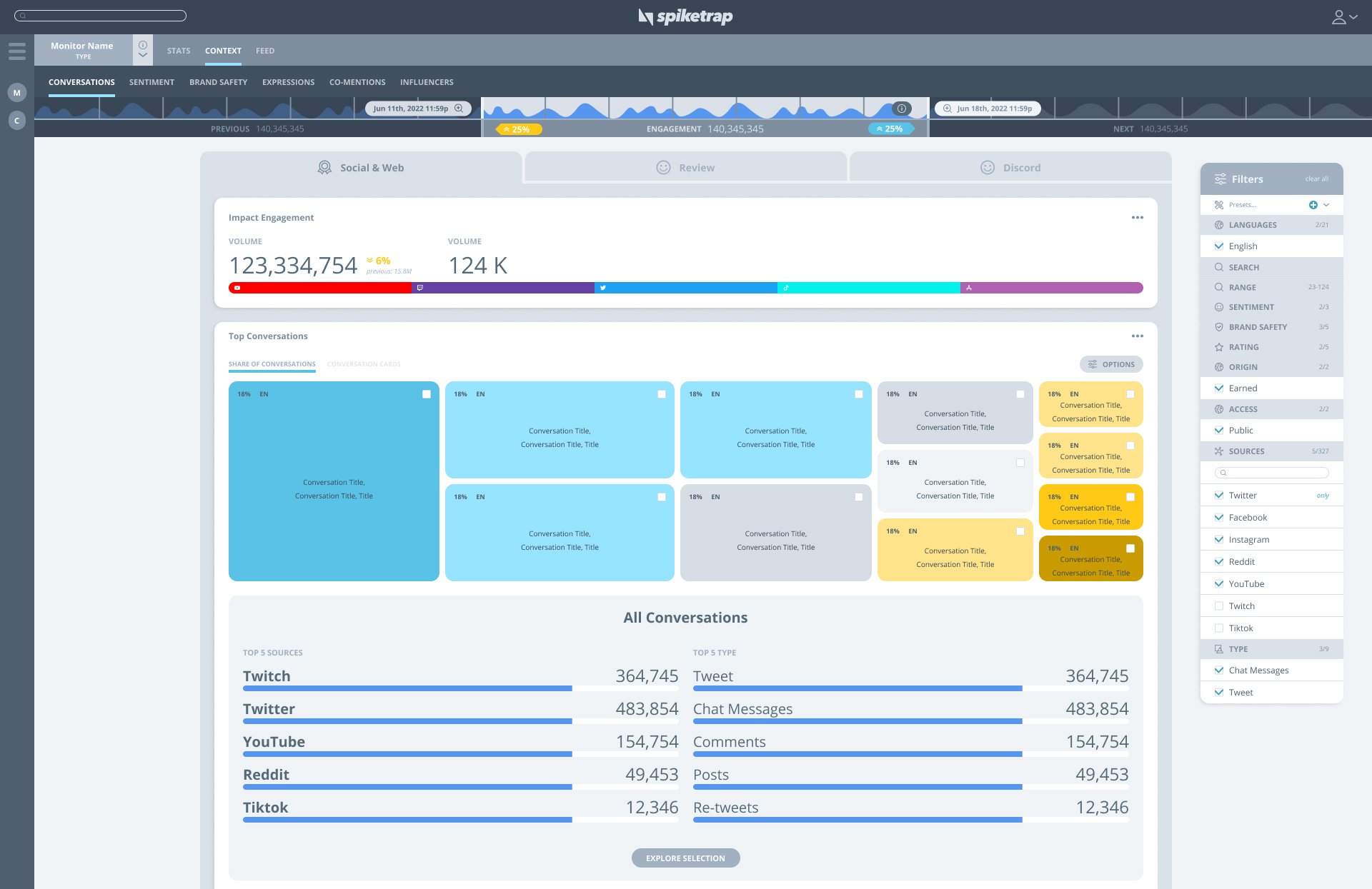
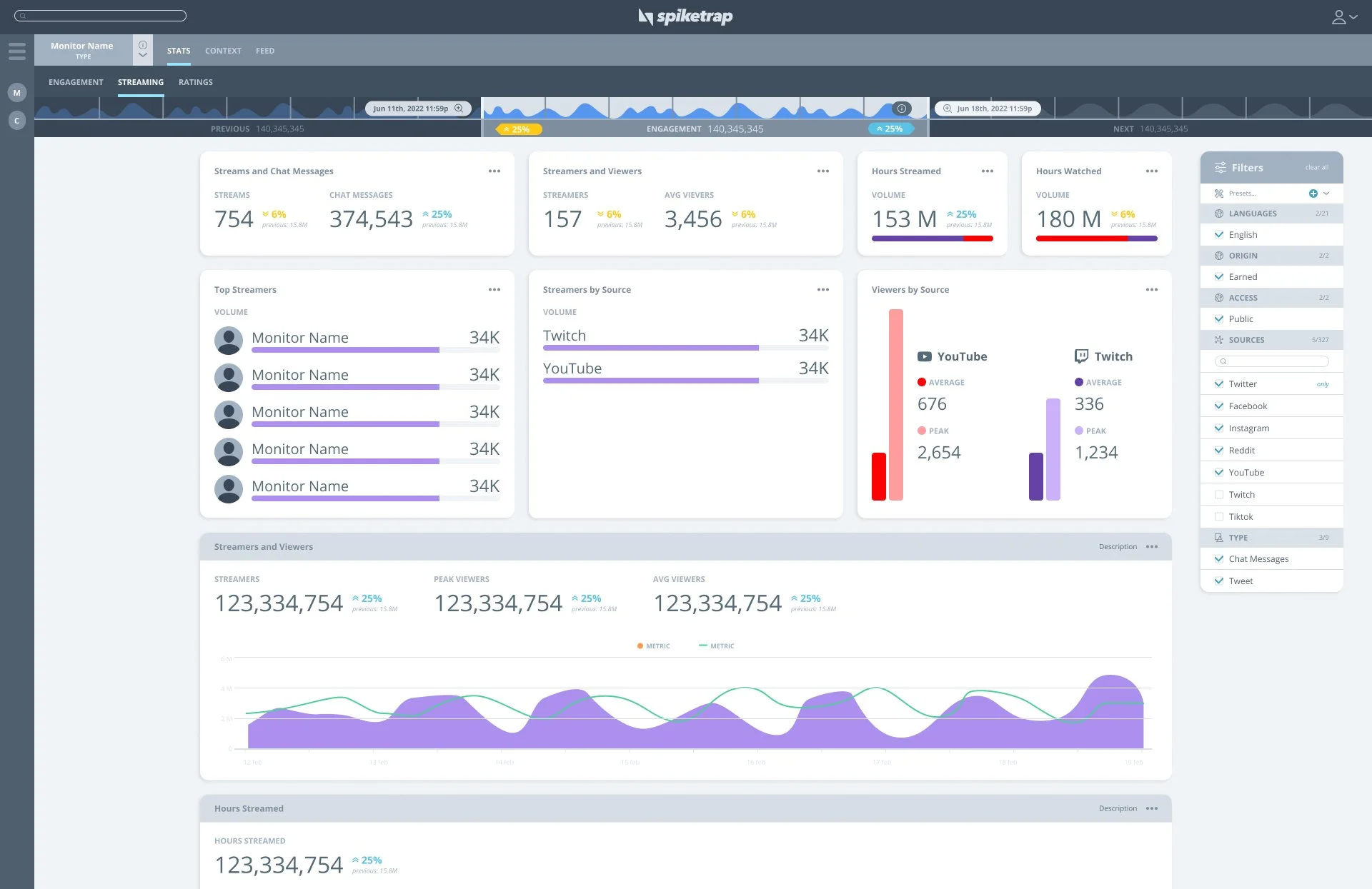
Wireframes
In this section, we explore the low-fidelity wireframes that outline preliminary designs for Spiketrap’s platform. These wireframes serve as the foundational blueprints, providing a visual representation of the user interface and its components before high-fidelity elements are added. They are essential for iterating design concepts quickly and efficiently, ensuring that the structure and functionality meet user needs and project goals.


Time Selector and Filters Study:
For a data platform that handles real-time data, designing an effective time selector was a critical challenge. To address this, we developed the idea of a dynamic time selector bar. This feature allows users not only to scroll quickly through various time frames—from granular minutes to broader historical views—but also to get a quick preview of engagement data for the selected time window compared to equivalent past and future periods. Our wireframe showcases this innovative approach, focusing on usability and quick data access, facilitating precise adjustments and insightful data retrieval tailored to specific needs.

Filters Selection Panel:
The filters selection panel is a crucial component detailed in our wireframes. This panel is designed to allow users to seamlessly toggle between different data sets and parameters, enhancing their ability to refine and segment the data displayed. In response to user requests, we included the ability to save filter presets, allowing users to replicate the same data set across different sessions or situations. My wireframe iterations emphasize clarity and ease of use, ensuring that users can apply or modify filters, and access their saved presets without confusion or unnecessary clicks, thereby optimizing the data analysis process.

Custom Report Form:
The custom report form is a key feature represented in our wireframes, designed to cater to users needing to generate tailored reports. This form now includes the capability to create complex boolean data searches, allowing users to conduct detailed comparisons against specific monitors. The layout of the form is crafted to be intuitive, guiding users through each step of report customization—from selecting specific data points to defining the report’s structure with boolean logic. Our focus was on creating a user-friendly interface that simplifies these complex selections and configurations, enabling users to efficiently compile and customize reports according to their precise analytical needs.

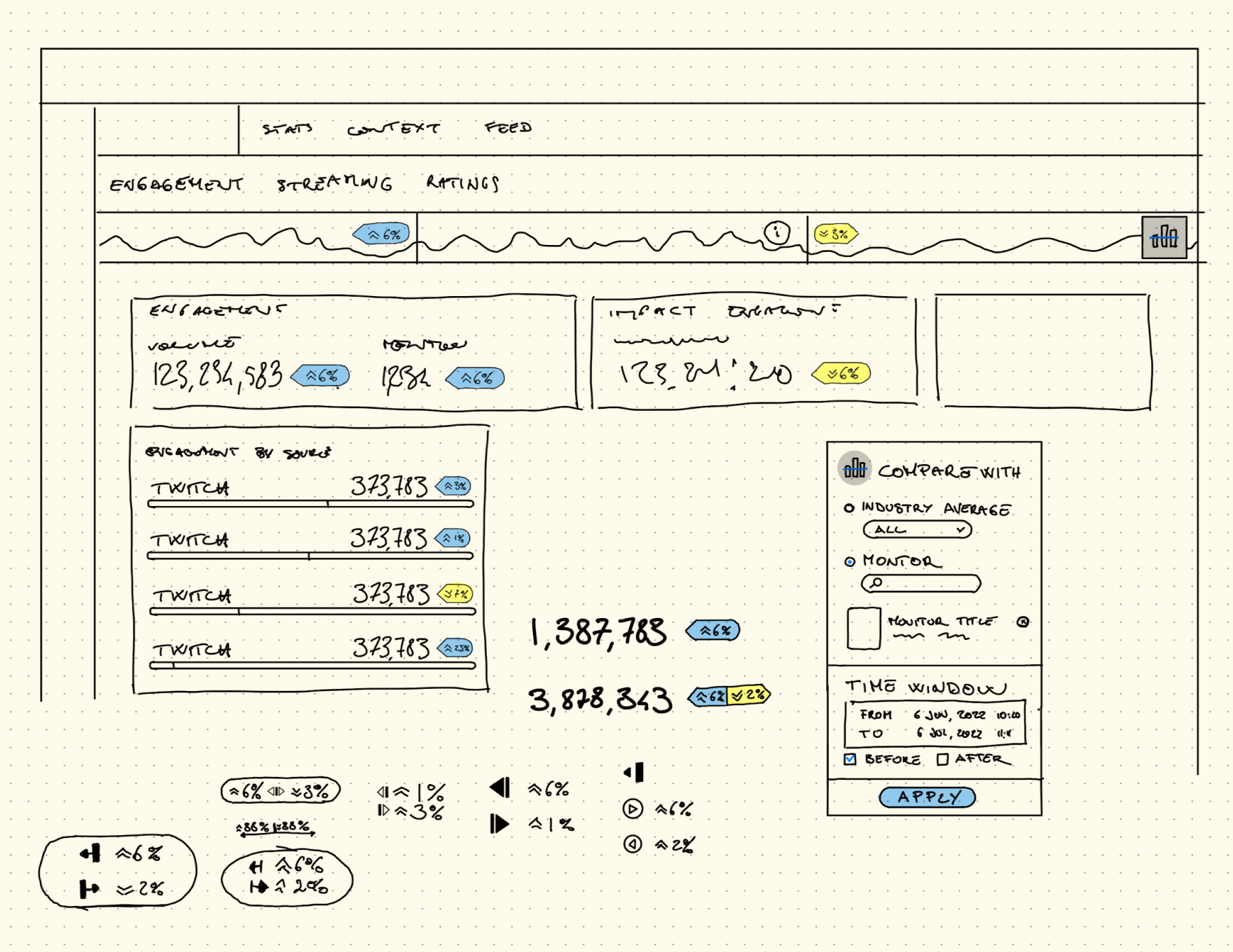
Studies on Graphs and Data Visualization:
In developing Spiketrap’s platform, we focused on selecting the right graphs and data visualizations to present complex data clearly and consistently. Our studies evaluated various visualization formats, such as line graphs, bar charts, heat maps, and scatter plots, to determine which best conveyed real-time and historical data insights. The challenge was to make intricate data sets comprehensible and visually consistent at a glance. This selection process ensures that our visual tools align precisely with user needs for thorough yet accessible data analysis.

//Conceptualization
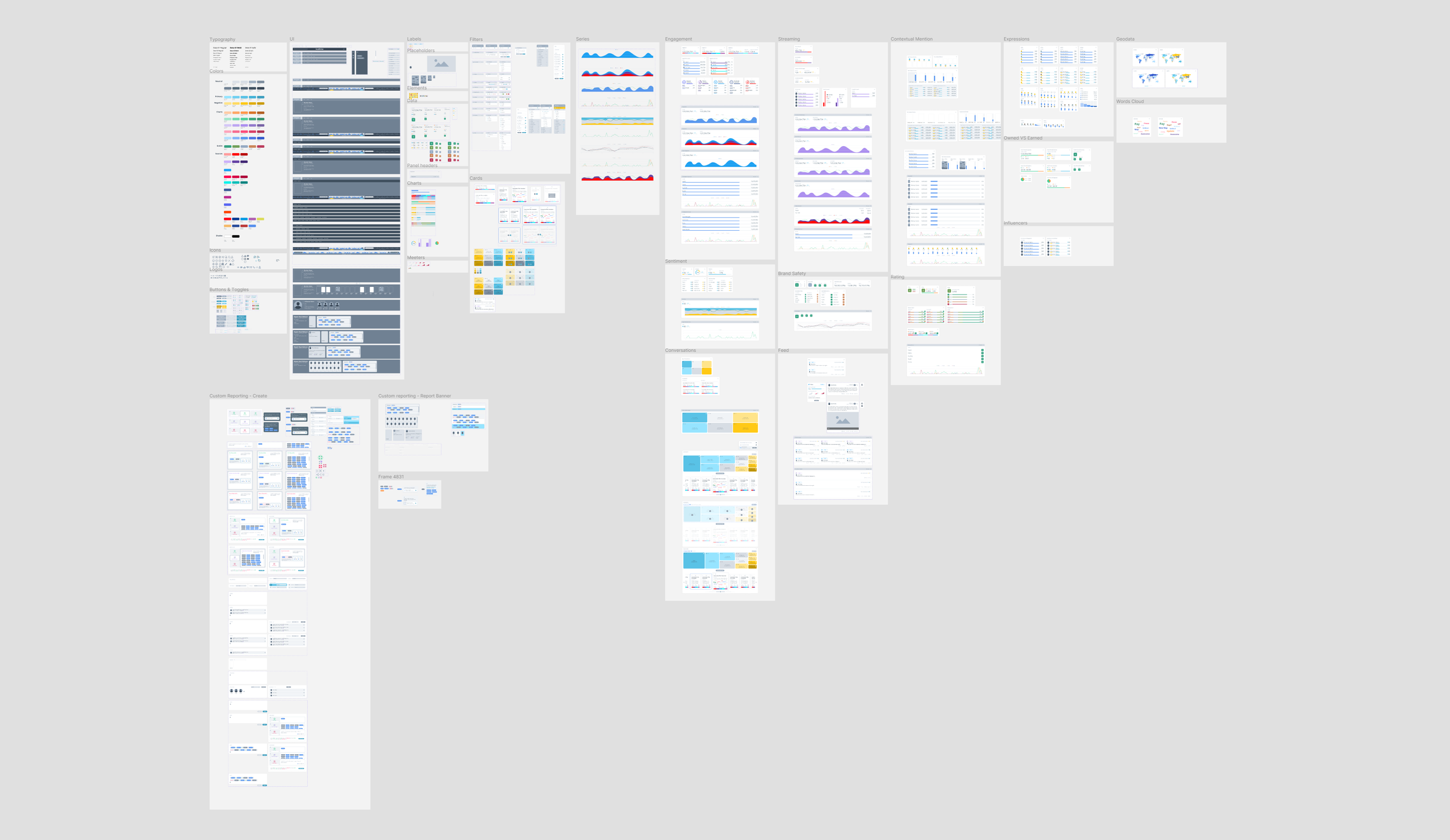
Design System
To ensure a cohesive and effective user interface on Spiketrap’s platform, I began creating a comprehensive design system. This system encompasses all essential UI elements, including typography, color schemes, button styles, and interactive components. By standardizing these elements, we aim to streamline the development process and maintain consistency across the platform, enhancing user experience through a visually coherent and functionally robust interface.


Iteration
//Iteration
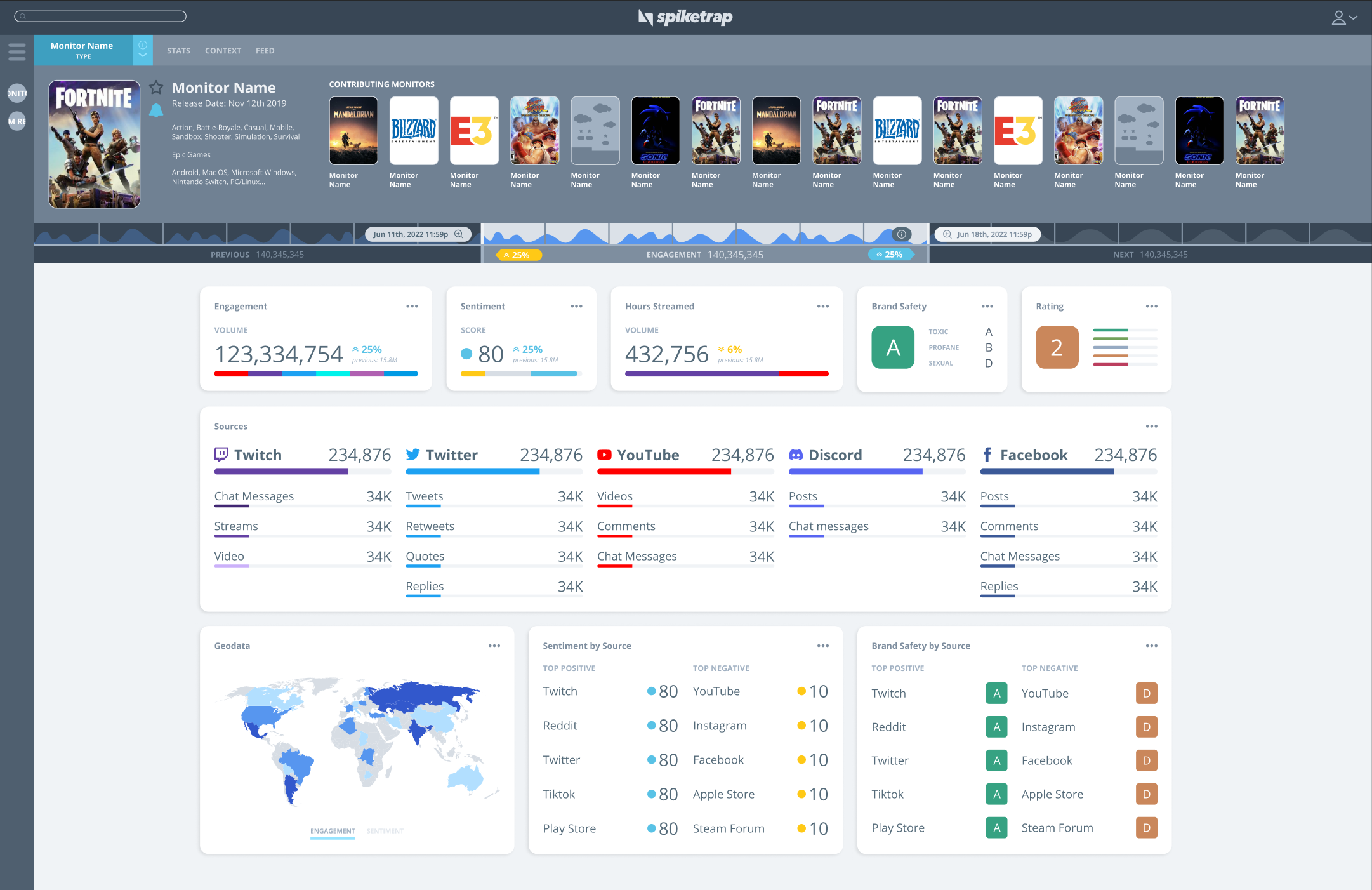
Mockups
During the mockups phase of the project, I translated our low-fidelity wireframes into high-fidelity mockups that incorporated the established design system. This phase allowed me to refine visual details and interactions, ensuring that each element aligns with the overall aesthetic and functional goals. The mockups provided a realistic preview of the final product, facilitating stakeholder feedback and enabling adjustments before moving into prototyping.


//Iteration
Prototype
In the prototyping phase, I transformed the detailed mockups into interactive prototypes that simulated the user experience of the final product. This crucial step allowed us to test usability and interactiveness, identifying any issues with flow, functionality, or user engagement. Through iterative testing and refinement, the prototype helped us ensure that the platform met both the technical and user-centered objectives, setting the stage for final development and launch.

//Iteration
Development and Testing
The testing and development phase marked the culmination of our design and prototyping efforts. During this phase, we worked closely with developers to integrate and implement all the features and functionalities from our prototypes into the final version of the platform. Rigorous testing, including usability testing, performance assessments, and bug fixes, was conducted collaboratively to ensure the robustness of the platform. This iterative process, driven by developer insights and real user feedback, allowed us to refine continuously and optimize the platform, ensuring the final product was both functional and user-friendly, ready for launch.
